

Google Messages is making ongoing adjustments to read receipts to enhance visibility and introduce a touch of style.
As hinted earlier, the message delivery status indicator has undergone a slight redesign. According to 9to5Google, Google is testing a subtle update to the RCS read receipts design that improves their visibility.
The color scheme has been reversed for a small yet significant effect. Previously, the checkmarks were white within a blue circle, but now the circle is white, and the checkmarks are blue.
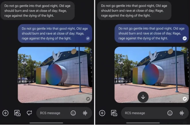
Since the message bubble is also blue, the revised read receipt design is more noticeable, making this a significant enhancement.
The new receipts began rolling out last week, but they have not reached all users. Specifically, it seems that only those who experienced a redesign—where the read receipts were moved from below the message bubble to inside it—have received the update.
For some users, the new indicators are only active in the main message list, while the actual chats still display the old design. Additionally, Google appears to be testing a subtle animation for sending messages, according to a previous report.
Another potential future update may include threaded replies for media attachments. The company might also enable reactions to images and videos by tapping on them instead of requiring a long press in the full chat summary.
As is often the case with updates to Google Messages, these changes may not seem substantial individually, but such small adjustments can enhance the overall user experience over time.
Moreover, with Samsung Messages and several carrier texting apps being phased out to promote Google Messages and RCS adoption, it is increasingly crucial for the company to make ongoing improvements to its messaging application.


Comments are closed.